?Go Pay - 移动电子钱包(? Go Pay - Mobile E-Wallet)

-中文-
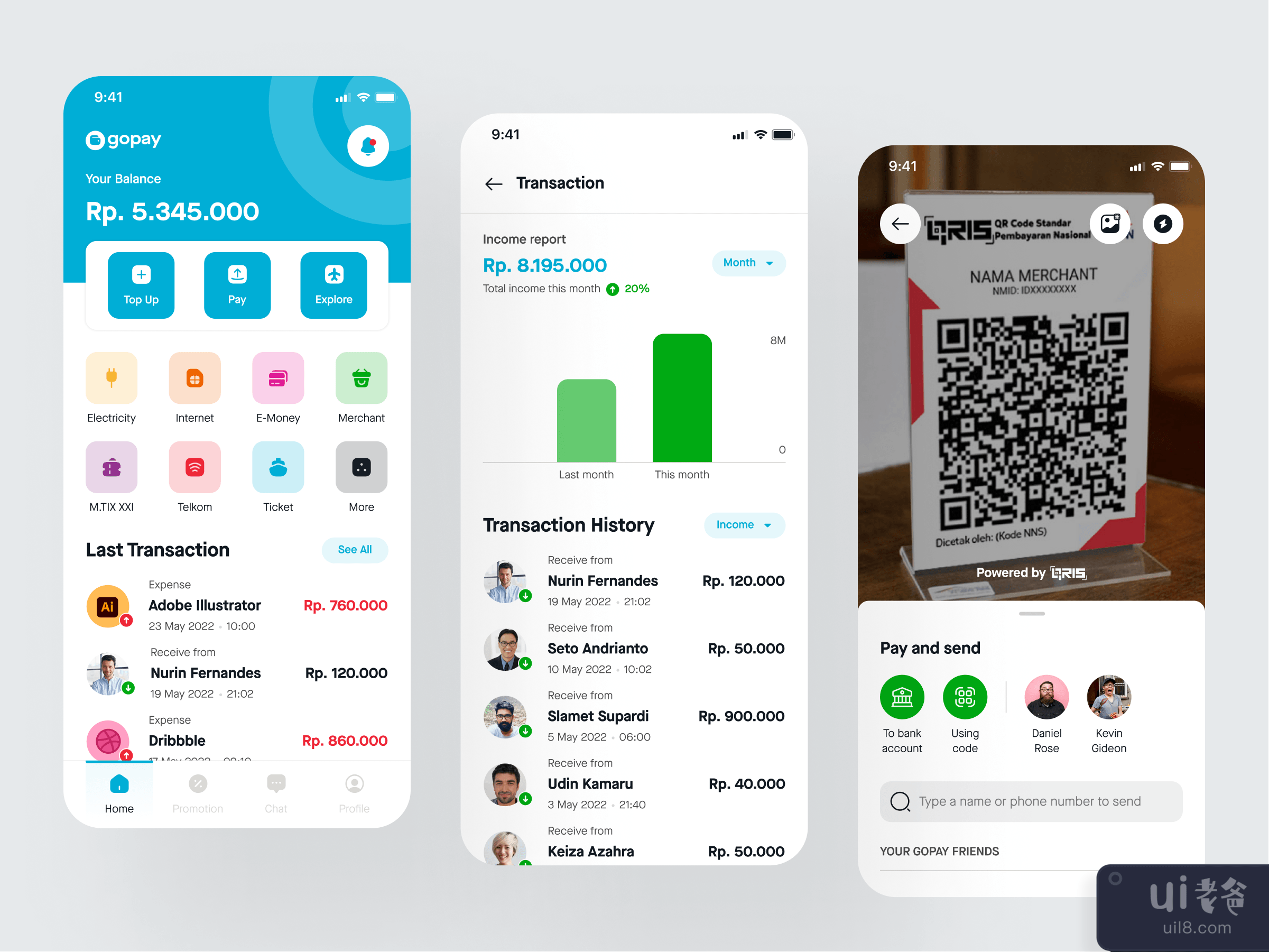
简介:大家好,这一刻我将分享我作为一个UI设计师的设计工作过程,做一个设计探索,这个案例比我其他的设计探索很 "特别",在这个案例中,我将为电子钱包平台做一个设计,以Go-Pay为主要案例,尝试从应用程序的流程做一个设计。在Medium获得完整的视图:点击这里 ✅目标这个设计探索将集中在我作为UI设计师来做一个界面,我没有在研究阶段涉及很多,我也没有做用户测试来验证设计结果。 探索设计过程在进行UI设计探索时,我的第一件事是选择应用程序的主题,正如我前面提到的,在这个案例中,我将制作一个基于Go-Pay的电子钱包应用程序,之后,我收集信息和设计参考,制作一个情绪板。 情绪板 在情绪板阶段,我通常会打开灵感应用程序,收集一些与探索相匹配的伟大设计,对于内容,我通常会在这时采取真实/活的应用程序,我为每个应用程序采取一些结构和菜单。这个阶段通常需要几个小时,这个阶段真的会影响到线框设计阶段,我得到的数据越多,我就越容易做出线框。 设计系统 ✅我在GoJek设计系统的基础上建立了设计系统,我从Asphalt Aloha设计系统中定义了颜色、排版(字体比例)、阴影和间距,还制作了一些带有变体的组件,这将对设计进度有很大帮助,并保持每个对象的一致性。 线框✏️我从情绪板中收集信息,并采取将出现在设计中的功能和菜单。当我做线框时,我确实想做的主要功能是主屏幕和交易过程,但当我做Hi-Fi设计时,我决定在设计中增加一个新的屏幕是登录和成功页面。 高保真 这是制作探索的最好部分,制作高保真使我作为UI设计师处于火热的状态,哈哈哈,我可以探索和尝试很多东西来制作一个好看的UI,也仍然为UX思考。 这个流程和现在的Go-Jek应用程序是一样的。当用户打开应用程序的时候,会出现闪屏(此时我把logo改成了GoPay),我也在考虑把所有Go-Jek的图标改成GoPay,使这个应用程序像Ovo或Dana一样独立,但我决定使用与GoJek相同的设计,因为我不想让用户认为这个应用程序需要你建立一个GoPay账户,所以这个设计概念让用户使用他们现有的GoJek账户。 在主屏幕上,我保留了GoJek的主页结构,但改变了应用程序的顶部,使余额有一个很大的部分,所以用户会更注意它,同时在一堆菜单的下面,我添加了交易历史,这个功能可以跟踪你每个月和每周的支出和收入,同时我做了一个图表来比较它,让用户知道他们的钱去了哪里和收入。我从Money Lover App获得这个流程,它是一个财务追踪器App,你可以在该App上写下你所有的交易,该App会给你报告。 对于支付和发送功能,我保持了与目前GoJek应用程序相同的流程,增加的内容是,我为用户做了一个信息说明。我还改变了一下审查和成功的屏幕,因为我在审查页面上找不到插图,所以要保持屏幕干净。 原型设计 对于原型设计,我做了3个流程,分别是:登录交易历史(支出和收入)付款和发送Figma原型设计你可以用Figma嵌入来尝试原型,每个流程我都在起点处做,所以如果你想跳到一个特定的流程,你可以点击左边的。 结束语 我从这次UI探索中学到了很多东西,它让我练习如何制作一个设计系统并将其实现在设计中,也让我在Figma中再次认识了原型设计工具,哈哈哈,其实我在设计工作室很少做原型,作为一个自由的UI设计师,客户通常不会要求我做一个原型(也是完整的设计系统)。当然,这个UI探索还远远不够完美,需要通过测试来验证设计理念和结果,以了解用户与设计的互动情况,也许在未来的某一刻,我可以好好地做这个工作:)。所以这就是我做UI探索的所有过程,它看起来并不像一个花哨的步骤或超级运动,哈哈哈,每一个阶段都是常规的,并不特别,我在Hi-Fi阶段真的花了很多精力,有时它使我停留在我的电脑的形式和思考什么是这个设计的完美颜色、图标和流程,它发生在这个UI探索和我以前做的其他UI探索中:)所以我认为这很正常。谢谢你读到这里,如果你想和我联系,我们可以在我的社交媒体上取得联系。Instagram | LinkedIn关于项目咨询 - hello@kretyastudio.com 干杯
-英文-
Introduction 👋Hello folks, for this moment I will share my design work process as a UI Designer making a design exploration, this case is quite “special” than other my design exploration, in this case, I will make a design for the e-wallet platform and take Go-Pay as the main case, try to make a design based from the app flow.Get full view at Medium:Click Here ✅ ObjectiveThis design exploration will focus on me as UI Designer to make an Interface, I’m not covering a lot for the research phase and I'm not doing user testing to validate the design result. Exploration Design ProcessThe first thing for me when doing UI Design Exploration is choosing the theme of the application as I mentioned earlier for this case I will make an e-wallet app based on Go-Pay, after that, I gather information and design references to make a mood board. Mood Board 😍In the mood-boarding phase, I usually open the inspiration app and collect some great designs that will be matched the exploration, for the content I usually took the real/live app at this point, I took some structure and menu for each app. This phase usually took a couple of hours for me, this phase really impacts the wireframing phase, the more data I get it will be easier for me to make the wireframe. Design System ✅I make the design system base on GoJek Design System, I define color, typography (type scale), shadow, and spacing from the Asphalt Aloha Design System, and also make some components with variants, which will be helping a lot in the design progress and keep the consistency for each object. Wireframe ✏️I gather the information from the mood board and take the feature and menu that will appear in the design.When I make a wireframe, the main feature I do want to make is the home screen and transaction process, but when I make the hi-fi design I decide to add a new screen to the design is a log-in and success page. Hi-Fi 👨🏻🎨This is the best part of making an exploration, making the hi-fidelity make me as UI Designer in fire zone hahaha, I can explore and try many things to make a good looking UI, also still thinking for the UX. This same flow as the current Go-Jek Application. When the user open the app splash screen will appear (at this moment I changing the logo to GoPay) also I’m thinking to change all Go-Jek icon into GoPay to make this app stand alone like Ovo or Dana, but I decide to use the same design with GoJek because I don’t want the user thinking this app need you to make a GoPay Account, so this design concept keeps the user using their current GoJek Account. On the home screen, I keep GoJek Home Structure but change the top of the application, making the balance have a big portion, so the user will notice it more, also bellow the bunch of menus I add transaction history, this feature can track your expense and income for each month and week, also I make a graph to compare it so the user knows where their money is gone and the income. I get this flow from the Money Lover App, it’s a financial tracker app, you can write down all your transaction on that app, and the app will give you the report. For the payment and send feature, I keep the same flow as the current GoJek App, the addition is, that I make a message note for the user. I also change a bit the review and success screen because I can’t find the illustration on the review page so keep the screen clean. Prototyping 👨🏻💻For the prototyping, I make 3 flows it’s a:LoginTransaction History (Expense and Income)Payment and SendFigma PrototypingYou can try the prototype with the Figma Embed, and each flow I make at Starting Point, so if you want to jump for a specific flow you can click on the left side. Closing 🔥I have learned a lot from this UI Exploration, it makes me practice how to make a design system and implement it into the design, also it’s made me meet prototyping tools again in Figma hahaha, I rarely do prototype actually at a design studio and as a freelance UI Designer, the client usually not asking me to make a prototype (also full design system).Of course, this UI Exploration is far from perfect, needs testing to validate the design idea and result to know how the user interacts with the design, maybe in the future moment I can do that properly :).So that’s all process when I do some UI Exploration it does not look like a fancy step or super movement hahaha, every stage is a conventional not really special, I really take a lot of energy at the Hi-Fi stage, and sometimes it makes me stuck in the form of my computer and thinking what the perfect color, icon and flow for this design, it’s happening in this UI Exploration and other UI Exploration I made before :) so I think it’s normal.Thank you for reading until this part, also to get in touch with me we can get connected on my social media: 😍Instagram | LinkedInFor Project Inquiry - hello@kretyastudio.com Cheers 🍻


.png)
.png)
