HYRED - 标志设计(HYRED - Logo Design)
-中文-
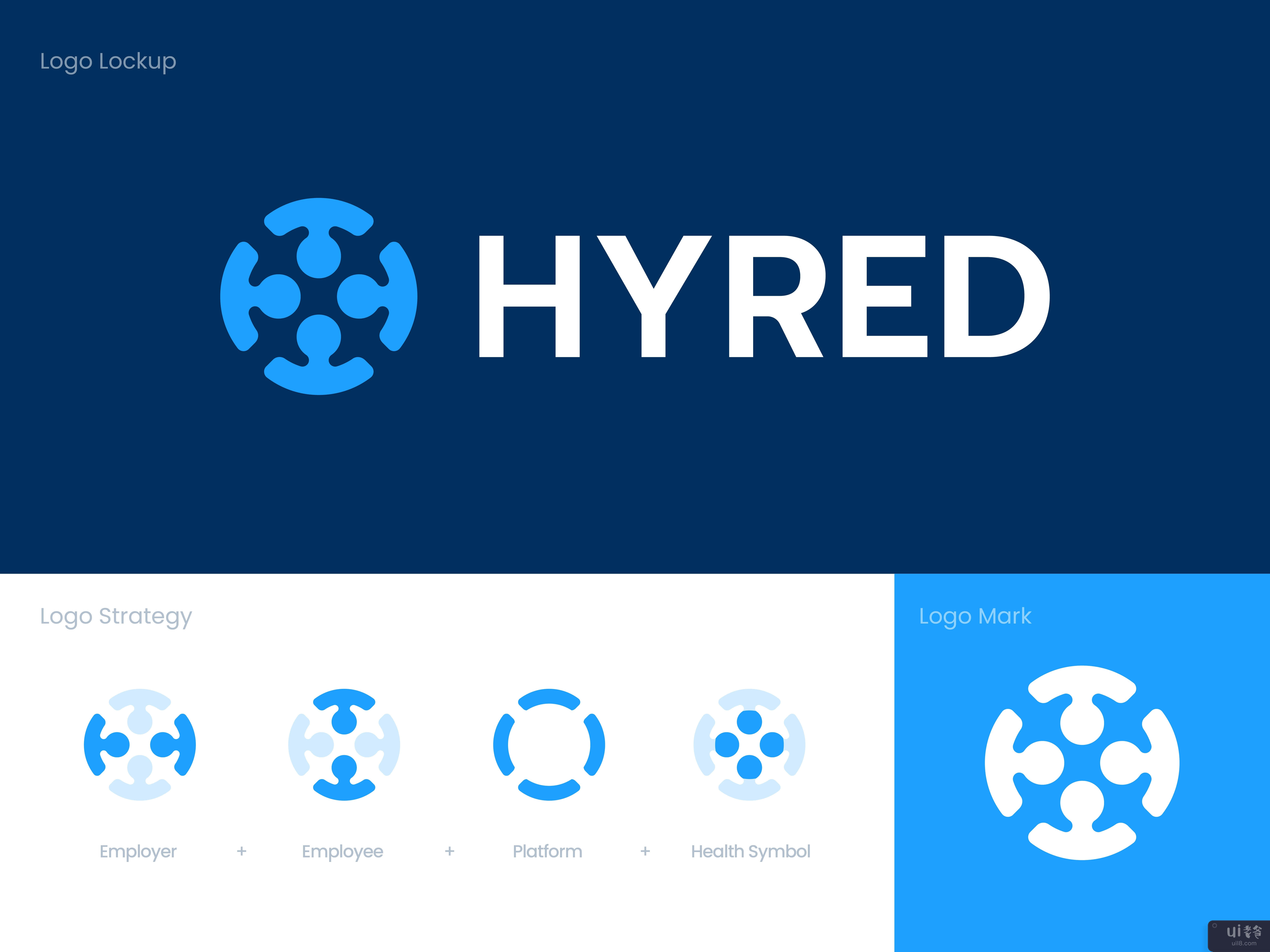
Hyred是一个专业的网络平台,以应对德国一些行业持续的专业人员短缺,主要是在健康领域。他们找到我们,要求我们将他们现有的品牌和视觉语言重塑为一个现代的、值得信赖的品牌,在他们所有的沟通渠道中保持一致。 挑战对于HYRED的新形象,我面临的挑战是开发一种视觉语言,能够传达信任、协作和专业性,并具有现代感和强大的元素,但又不复杂和平易近人。解决方案我研究、制定战略,并设计了新的HYRED的视觉形象,由一个全新的设计语言支持,在所有平台上保持一致。我结合了雇员、平台、雇主和健康符号等隐喻。字标用字母拼出了品牌名称,感觉有条不紊,易于理解,强调了产品的力量和简单性。让我们一起工作!请联系 usman@kickstudio.coFollow 在Behance | LinkedIn | Instagram上
-英文-
Hyred is a professional networking platform to counteract the ongoing professional shortage in some industries in Germany, mainly in the health sector. They reached us to rebrand their existing branding and visual language to a modern and trustworthy brand that's consistent across all of their communication channels. The challengeFor the HYRED's new identity I faced the challenge of developing a visual language that could communicate trust, collaboration, and professionalism, with elements that could feel modern and powerful yet uncomplicated and approachable.The solutionI researched, strategized, and designed the new HYRED's visual identity, supported by a spanking new design language that is consistent across all platforms.The logo features a simple symbol that brings the platform's mission to the forefront: connecting employees with the employers in the health sector. I combined metaphors like an employee, platform, employer, and the health symbol. The wordmark spells the brand name in letters that feel structured and accessible, emphasizing both the power and simplicity of the product.Your thoughts and feedback are welcome.Have a project in mind? Let's work together!Get in touch usman@kickstudio.coFollow on Behance | LinkedIn | Instagram

