厨房水槽字体(Kitchen Sink Typeface)


-中文-
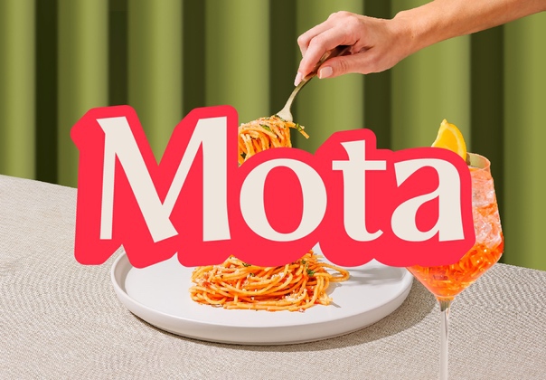
这种字体是以用来创作它的海绵最喜欢的地方命名的--厨房水槽。为了创造每一个字母,一块成型的海绵被覆盖在丙烯酸颜料上,在纸上多次涂抹,然后进行扫描。
为了在使用时创造变化以达到手工制作的效果,每个字母都有两个版本,只需选择大写或小写就可以切换了。该字体由三种风格组成--浅色、普通和粗体。我重新设想了这三个字,以代表应用的墨水量,而不是字体的重量!
-英文-
This typeface is named after the favourite haunt of the sponges which were used to create it - the kitchen sink. To create each letter, a shaped sponge was covered in acrylic paint, dabbed onto paper plenty of times and then scanned.
In order to create variation to achieve a handmade effect when used, each letter has two versions which can be toggled just by selecting upper or lower case. The typeface consists of three styles - light, regular and bold. I reimagined these three words to represent the amount of ink applied rather than the weight of the font!
声明:本站所有文章,如无特殊说明或标注,均为本站原创发布。任何个人或组织,在未征得本站同意时,禁止复制、盗用、采集、发布本站内容到任何网站、书籍等各类媒体平台。如若本站内容侵犯了原著者的合法权益,可联系我们进行处理。