拉迪--字体(Ladi - Typeface)
-中文-
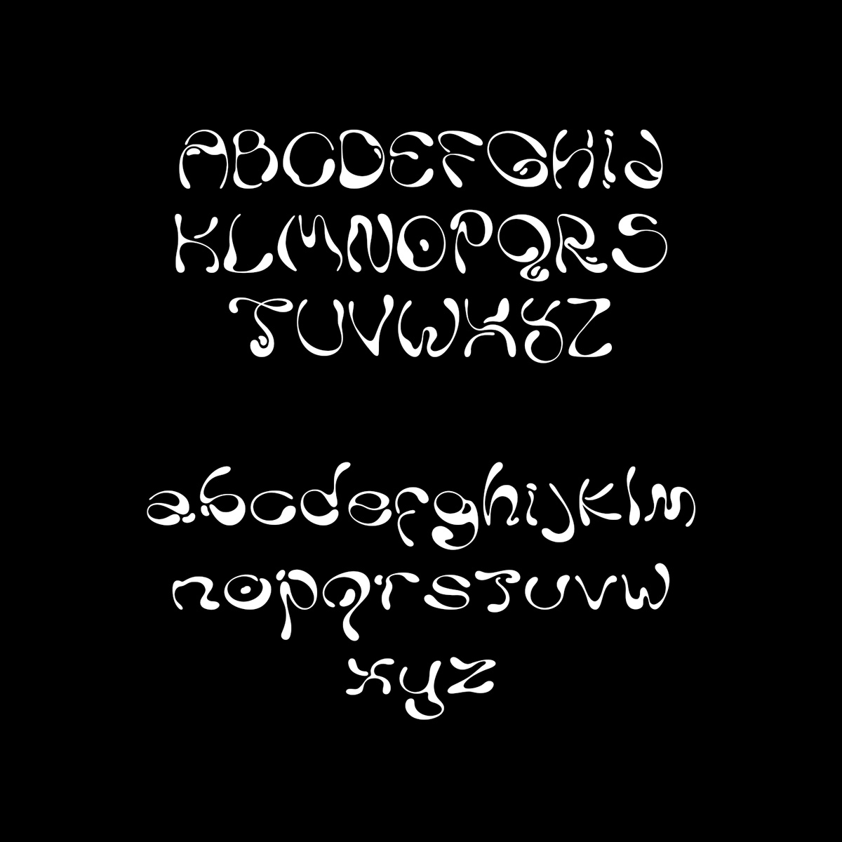
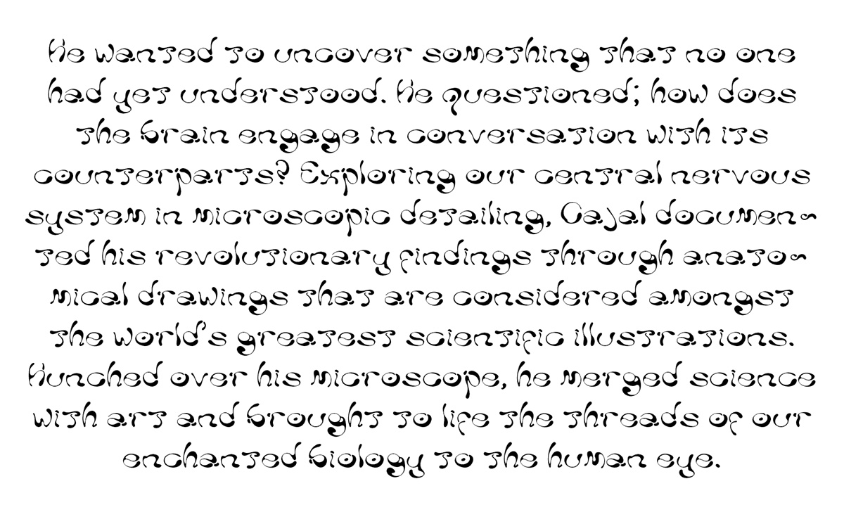
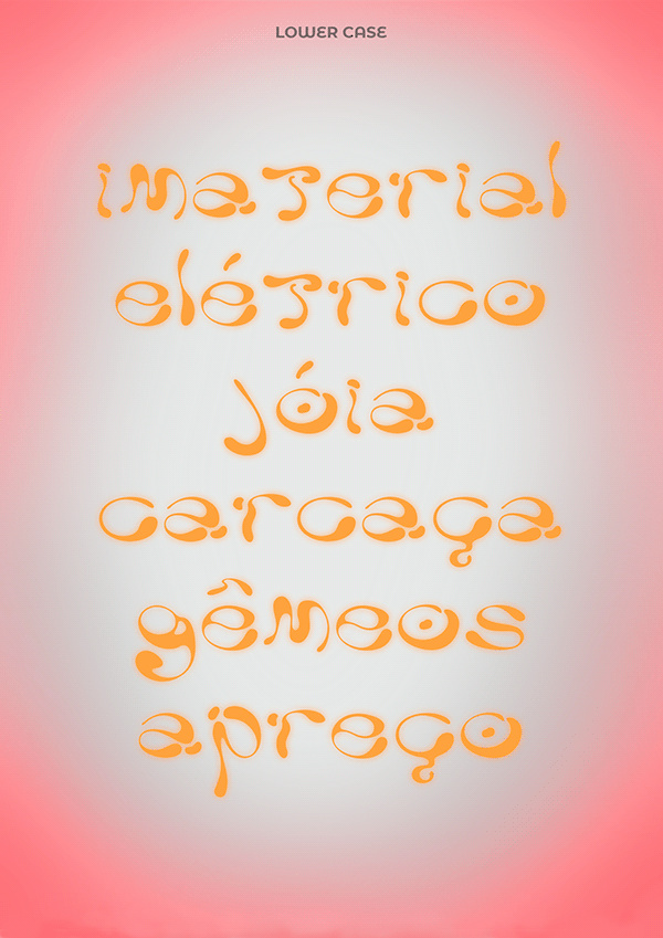
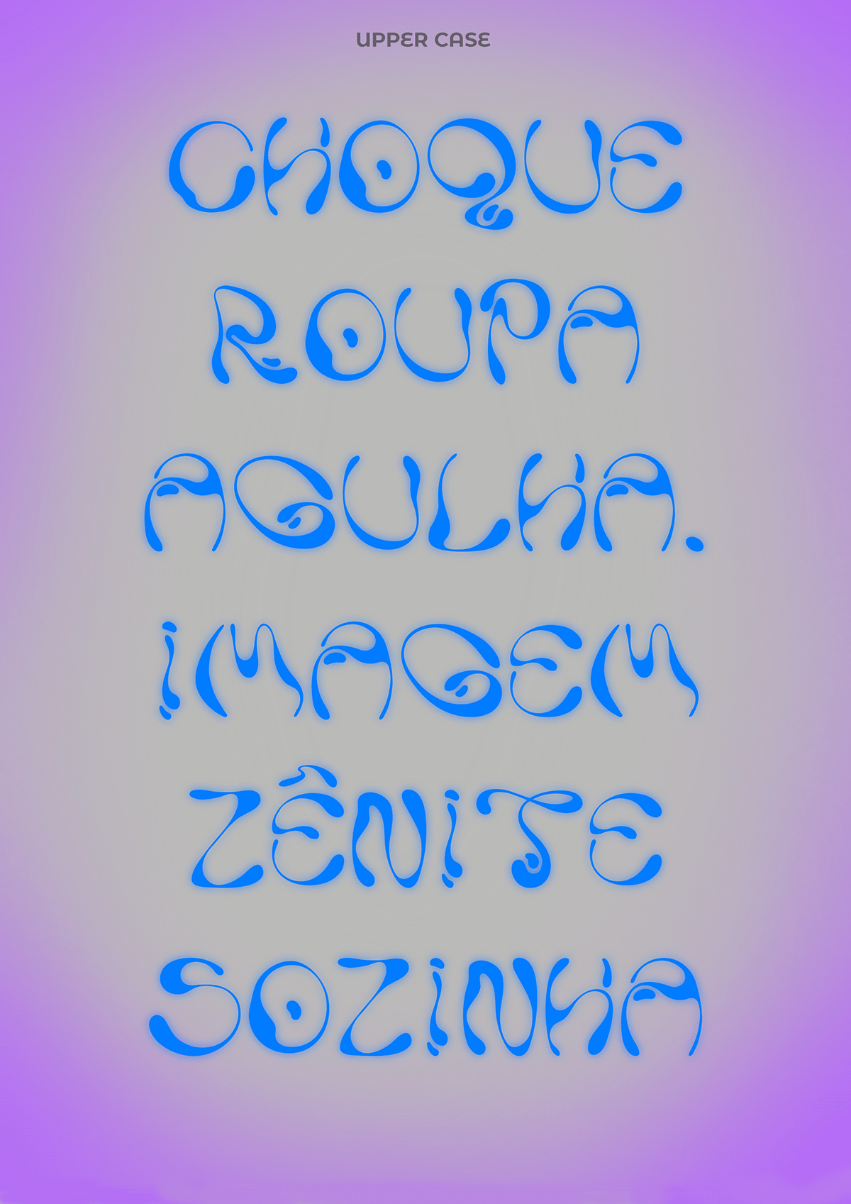
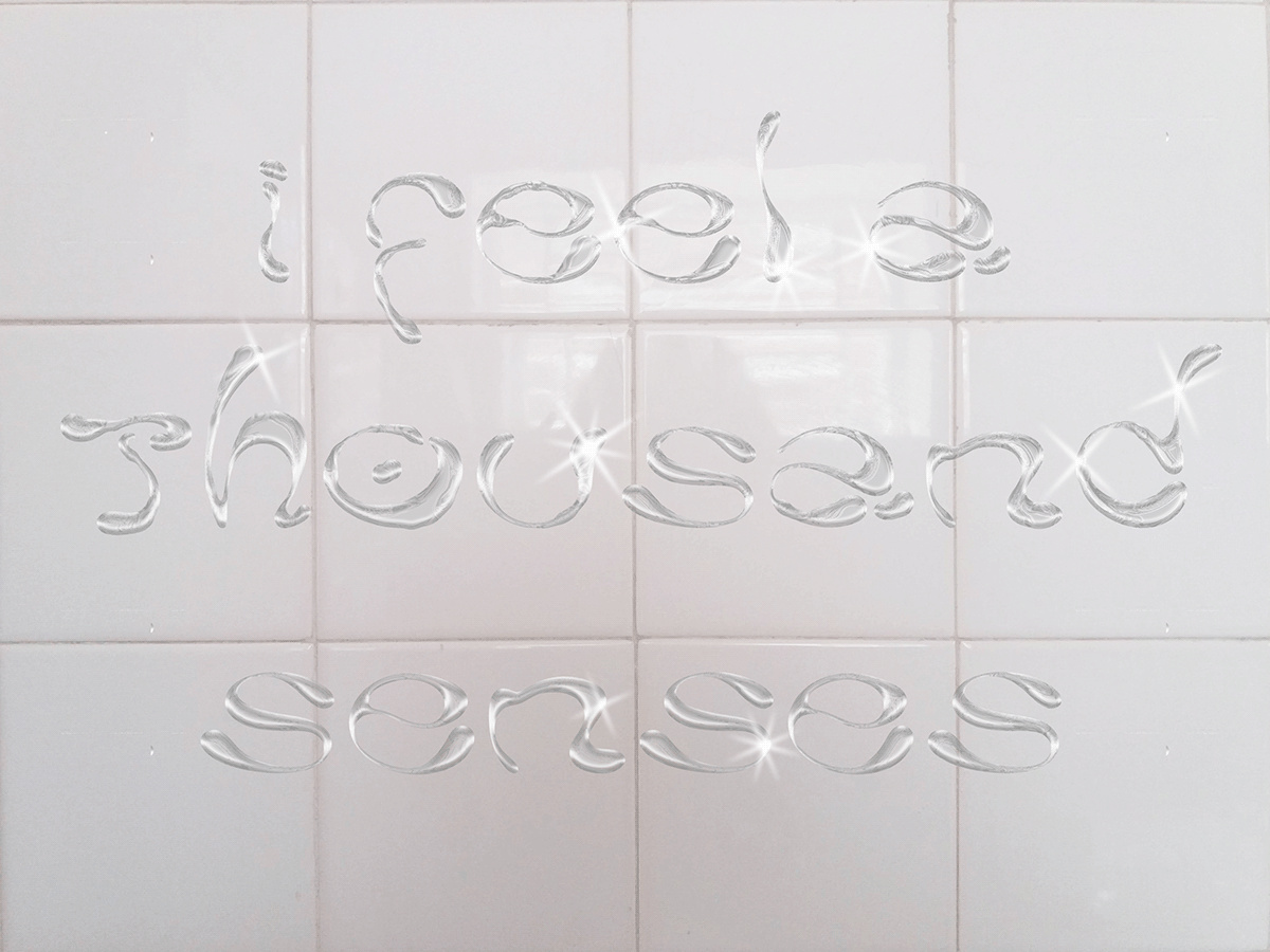
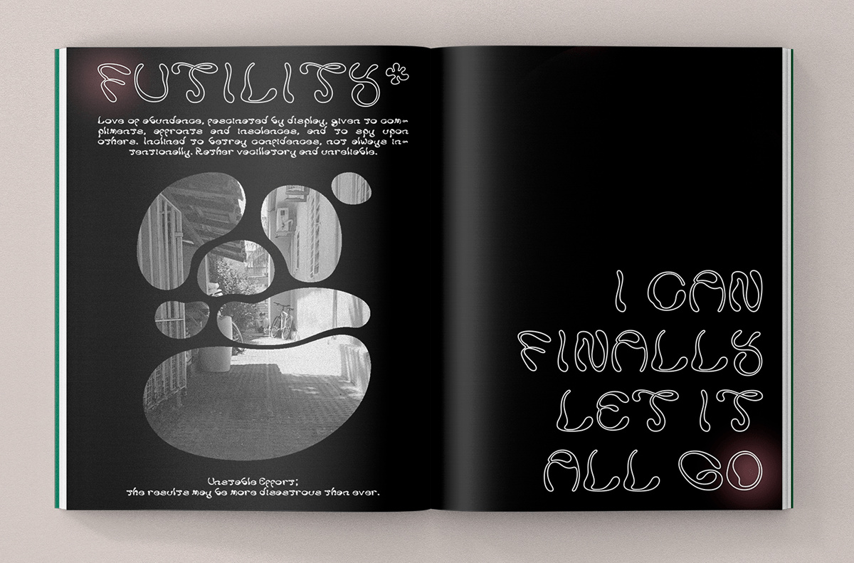
拉迪是一种基于液体形式的不对称字体,以显示其不平衡和不确定的曲线的高度对比。
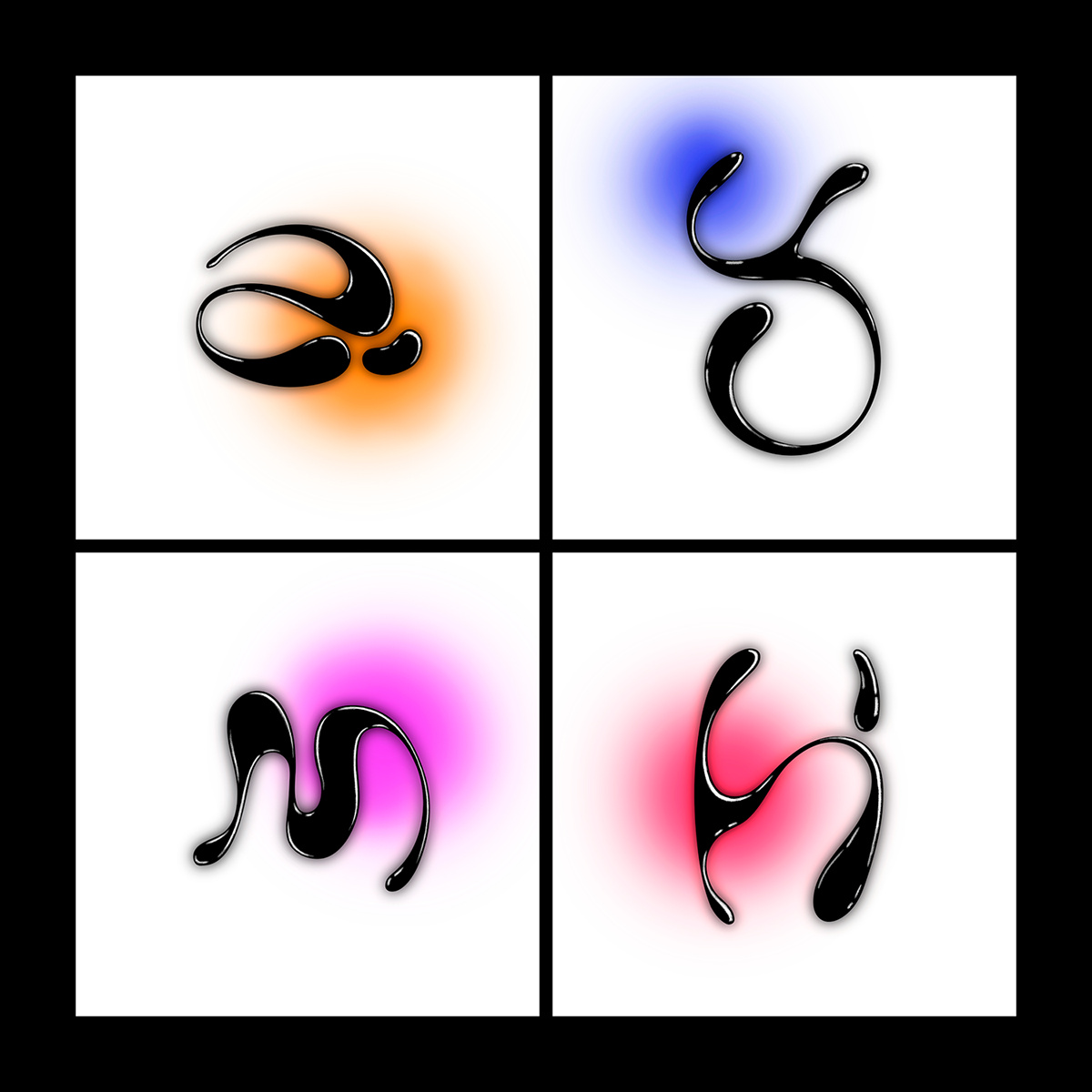
它的名字来自希腊语λάδι,意思是油,因为粘稠的物质是贯穿这些字形草图的最经常性的参考,它们被设计用来翻译流动性,类似于一种悬浮在不断运动中的密集液体。每个字母的形式都是他们自己的练习和实验,如何为眼睛描画出单独的路径,同时也关心塑造字形的中空空间,就像字母本身一样用心。
拉迪对个人和商业使用都是免费的!感谢Milena Leimig (https://www.behance.net/leimig)与社区分享这个免费软件。
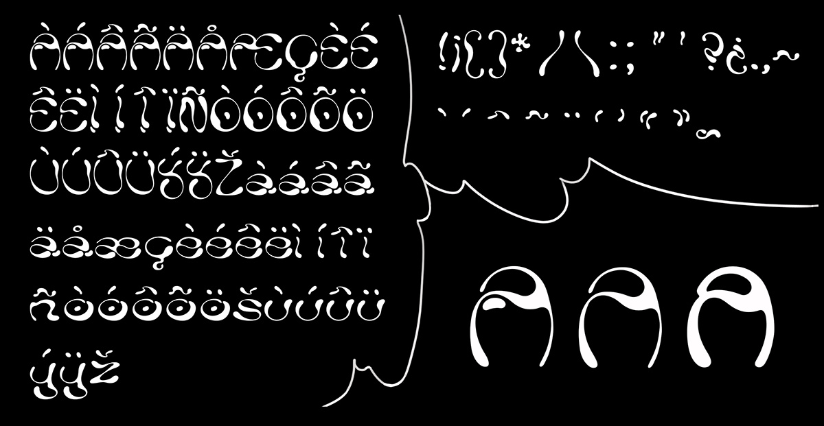
在下载之前,你可能想检查套件中的所有文件。
如果你喜欢这个设计,请确保在我们的网站上查看其他令人敬畏的字体,并在下面脚注部分的方框中填写你的电子邮件,订阅我们的新闻通讯,这样你就会在未来得到更多很酷的产品的通知,并为自己争取每周的免费赠品!
您的反馈和意见对我们来说非常重要如果您有任何问题、担忧或建议--请不要犹豫,在我们的社交媒体页面上联系我们,我们会尽快回答。
谢谢你,祝你设计愉快!
-英文-
Ladi is an asymmetric typeface based on liquid forms, to display a high contrast in its imbalance and uncertain curves.
Its name comes from the Greek word λάδι meaning oil, as the viscous substance was the most recurring reference through the sketches of the glyphs, which were designed to translate fluidity, resembling a dense liquid suspended in constant movement. The form of each letter was an exercise and experiment on their own on how to trace individual paths for the eye, while also caring to shape the hollow spaces of the glyphs as attentively as the letters themselves.
Ladi is free for personal and commercial use! Thanks to Milena Leimig (https://www.behance.net/leimig) for sharing the freebie with the community.
You may want to check all the files in the kit before you download it.
If you enjoy this design, make sure to check out other awesome fonts on our website and subscribe to our newsletter by filling your email in the box below in the footer section so you will be notified of more cool products in the future and get yourself weekly freebies!
Your feedback and opinions are very important to us! Should you have a question, concern, or suggestion - don't hesitate to reach out on our social media pages and we'll answer as soon as we can.
Thank you and enjoy designing!

