Buzzvil设计系统(Buzzvil Design System)

-中文-
Buzzvil 设计系统 - Figma 和 Adobe XD 的免费赠品
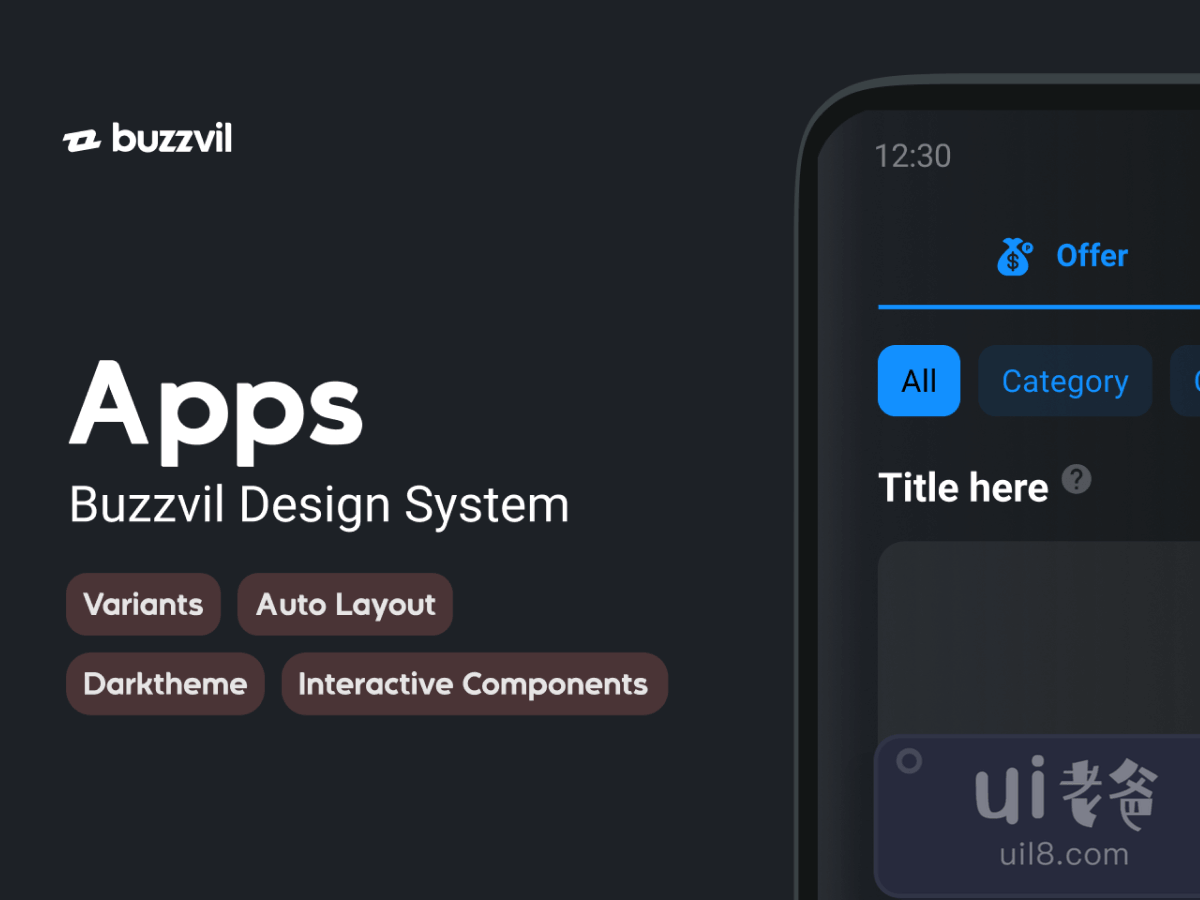
Buzzvil App UI 库是专门为我们的合作伙伴创建数十个应用程序的移动唯一库。我们非常喜欢它,所以我们决定将它分享到这个令人惊叹的 Figma 社区!享受!我们摆脱了所有细节,保留了所有我们认为对其他人有帮助的东西。如果您想了解更多信息,请随时访问我们的在线文档:Buzzvils 设计系统和我们的 Dash UI 库(管理器)。无处不在的自动布局 所需的一切都使用自动布局预先构建。它可以更好地控制编辑、排序、填充和对齐。当组件开始相互嵌套时,自动布局是救命稻草。变体是新的黑色变体保持整洁!我们使每个组件结构尽可能平坦,以便轻松覆盖属性。它还有助于保持文件轻松。当我们开始为单个组件提供大量变体时,我们使用嵌套的 Master 组件来统治它们。暗模式就绪我们的整个 UI 库都支持暗模式!我们让它优雅,但它是相当新的,所以我们将不胜感激任何反馈!交互式组件(仅限 beta 用户) 我们的大部分动作组件已经连接好!只需从库面板中拖放它们,它就已经存在了!我们将在未来继续更新这部分并提供更好的支持。约定 因为事情很快就会变得一团糟,我们一直在使用清晰的命名约定以保持一致性和可读性:在库级别上,组件名称将尽可能简单和具有描述性(按钮、单选、复选框……)在项目范围内, 共享组件将使用项目名称命名: [Project]/[Component] 在页面范围内,将使用页面名称命名组件: [Page]/[Component] 文件内容 组件分为多个类别遵循我们的设计系统结构。选择一个组件并通过属性面板中的描述链接访问相关页面。你好颜色手风琴徽章和芯片按钮卡片和横幅条目反馈页眉和页脚图标列表模式进度选项卡文本切换支持 UI(Android / iOS 这个免费赠品 Buzzvil 设计系统最初由 Buzzvil 在此 url 上共享。此免费赠品的类别未分类。制作这个免费赠品的工具是 Figma 和 Adobe XD。有用提示:如果许可证未知,通常是因为他们忘记明确提及,而不是因为他们小气。在将其用于商业项目之前,您可以询问Buzzvil 很好,他们可能会允许你使用它。
-英文-
Buzzvil Design System - Freebies for Figma and Adobe XD
Buzzvil App UI library is Mobile only library dedicated to creating dozens of Applications for our partners. We like it very much so we decided to share it onto this amazing Figma Community! Enjoy! We got rid of all the specifics and kept all the things we thought would be helpful to others. If you want to know more, feel free to visit our online doc: Buzzvils Design System And our Dash UI Library (manager). Auto-layout everywhere Everything needed is pre-built with Auto-layout. It gives a better control on editing, ordering, padding & alignment. Auto-layout is a life savior when components start to be nested into each other. Variants is the new black Variants are keeping things tidy! We keep each component structure as flat as possible so its easy to override properties. It also helps to keep the files light. When we start having tons of variants for a single component, we use a nested Master component to rule’em all. Dark-mode ready We support dark mode for our entire UI library! We made it classy, but it’s fairly recent so we would appreciate any feedback on that! Interactive components (beta users only) Pretty much most of our action components are already wired up! Just drag and drop them from the library panel and it’s already alive! We will be continuing updating this part with better support in the future. Conventions Because things can get messy real fast, we’ve been working with clear naming conventions for consistency & readability: On library level, a component name will be as simple and descriptive as possible (Button, Radio, Checkbox…) On a project scope, shared components will be named by using project name: [Project]/[Component] On a page scope, components will be named by using the page name: [Page]/[Component] What’s inside the file Components are divided into multiple categories that follow our Design System structure. Select a component and access the related page through the description link in the property panel. Hello Colors Accordion Badge & Chip Button Card & Banner Entry Feedback Header & Footer Icons List Modal Progress Tab Texts Toggle Support UI (Android / iOS This freebie Buzzvil Design System was originally shared by buzzvil on this url.The categories for this freebie are Uncategorized. Tools used to create this freebie are Figma and Adobe XD. Helpful hint: If the license is unknown, it is usually because they forgot to mention it explicitly; not because they were being stingy. Before using it for a commerical project, you can ask buzzvil nicely and they will probably allow you to use it.


