Tasker - Todo App Uplabs 挑战(Tasker - Todo App Uplabs Challenge)

-中文-
大家好,最近,
我在 Uplabs Google Gmail 重新设计挑战中发布了我的提交内容,人们非常喜欢它。
Gmail 挑战:https://www.uplabs.com/posts/gmail-redesign-uplabs-challenge-免费赠品
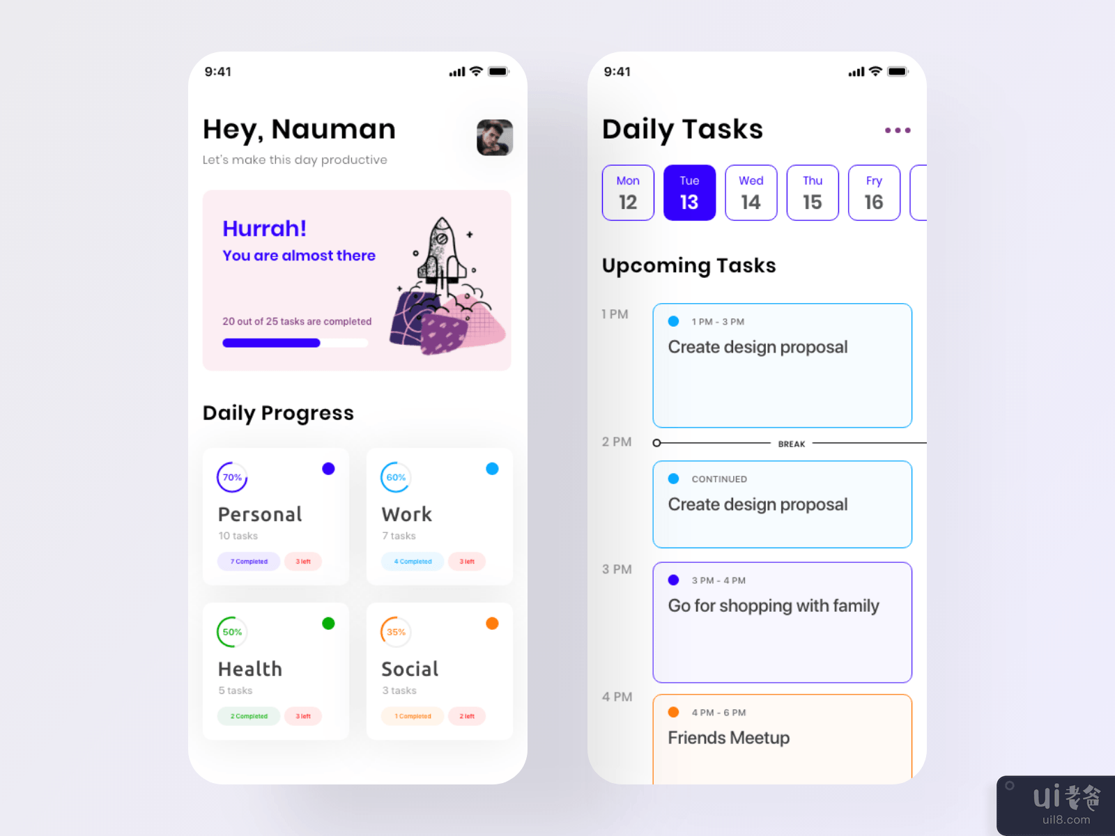
因此,我决定尝试 Uplabs 的另一个挑战,这次是 Todo 应用程序重新设计。就个人而言,我已经尝试了一堆 Todo 应用程序,其中一些我真的很喜欢它们,但我发现大多数应用程序并没有太注意让用户了解他们如何使用仪表板而不是他们提供大量的统计数据,很难一目了然地衡量当前的进度。
因此,我试图在这次探索中解决这个问题,确实它不是完整的应用程序,而是针对特定问题的解决方案。
在 Dribbble 上表达一些爱:https://dribbble.com/shots/9626994-Tasker-Todo-App-Uplabs-Challenge
希望你们会喜欢它,随时分享您的评论和有价值的反馈你认为解决这个用户体验问题是你的偏好吗?
-英文-
Hey guys, Recently,
I posted my submission for Uplabs Google Gmail Redesign Challenge and people really loved it.
Gmail Challenge: https://www.uplabs.com/posts/gmail-redesign-uplabs-challenge-freebie
So, I decided to try another challenge from Uplabs, this time a Todo App Redesign. Personally, I've tried bunch of Todo App and some of them I really loved them but one thing I mostly found that most of the apps don't pay much attention to give a user a glimpse of how they are doing using Dashboards rather they provide huge data in statistics and it's very hard to measure the current progress in a glance.
And therefore, I tried to resolve this issue in this exploration, Indeed it's not complete app but rather the solution to a specific problem.
Show some love on Dribbble: https://dribbble.com/shots/9626994-Tasker-Todo-App-Uplabs-Challenge
I hope you guys will like it, feel free to share your comments and valuable feedback on what do you suggest will be your preference to solve this UX problem?


