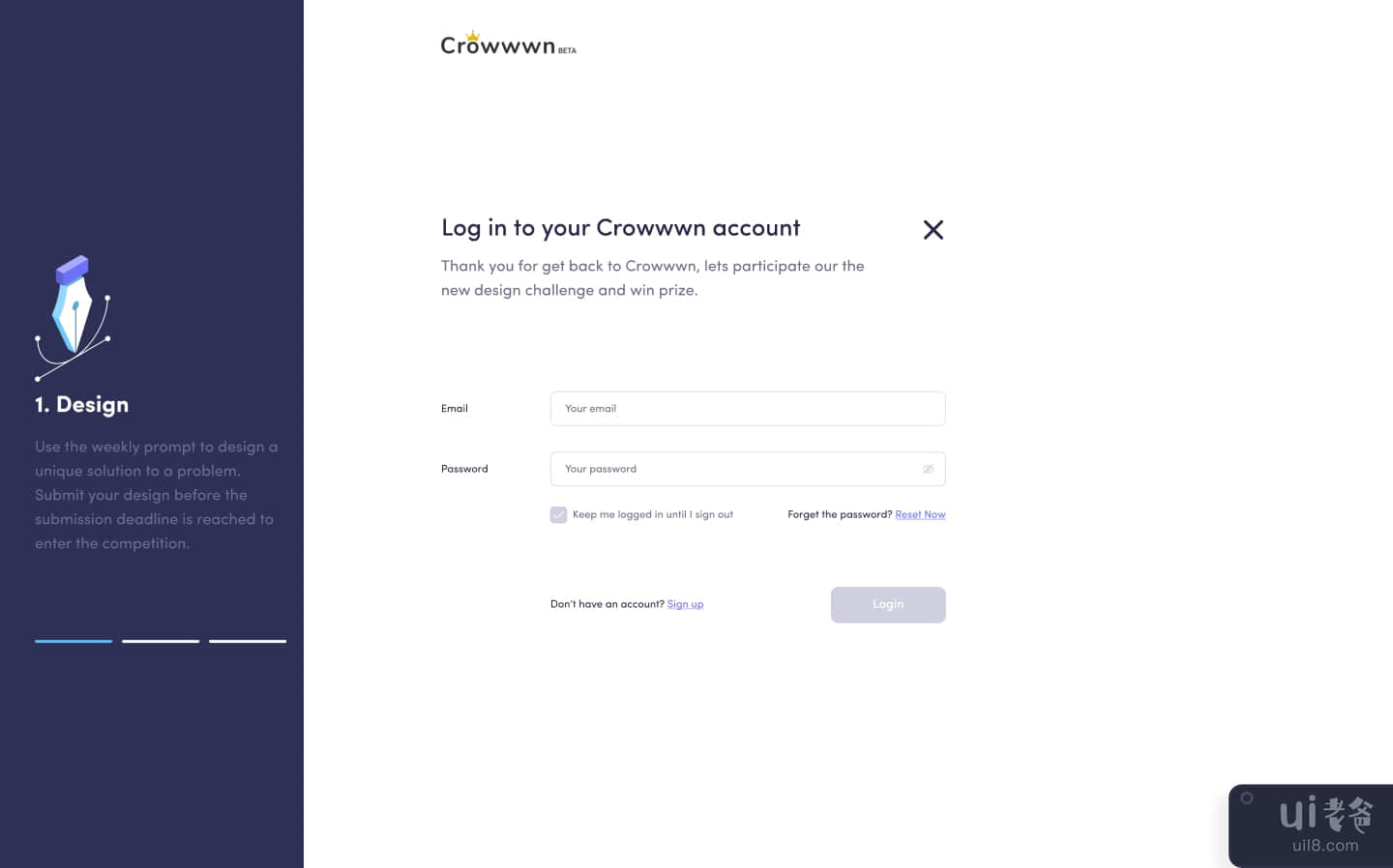
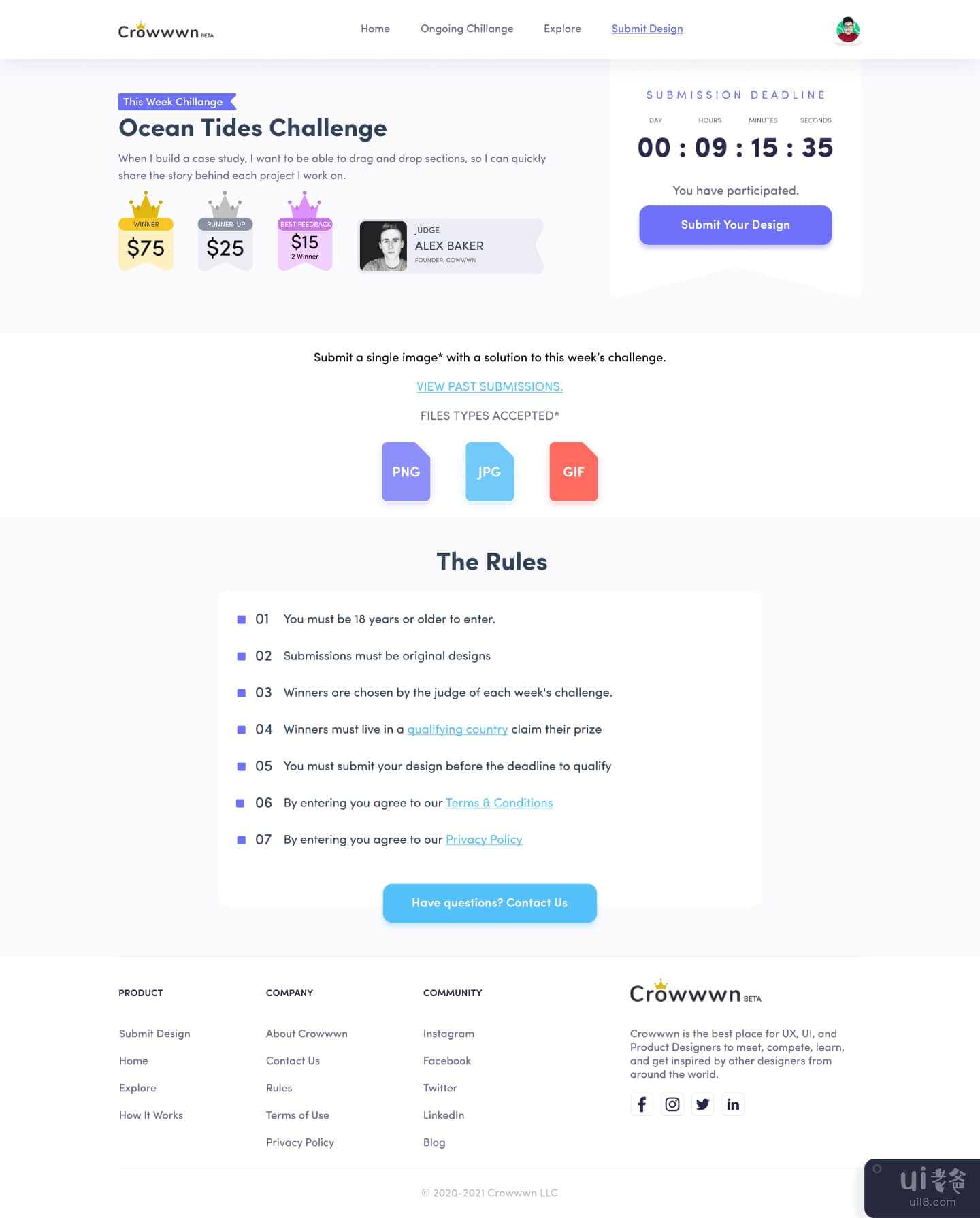
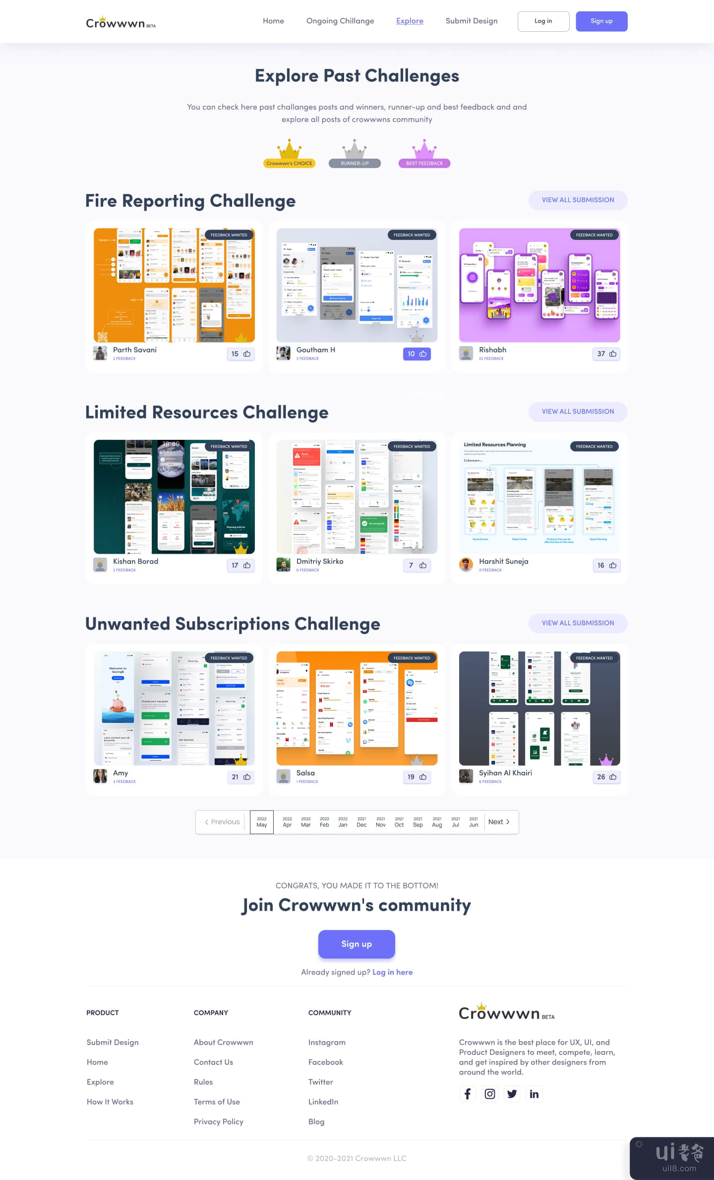
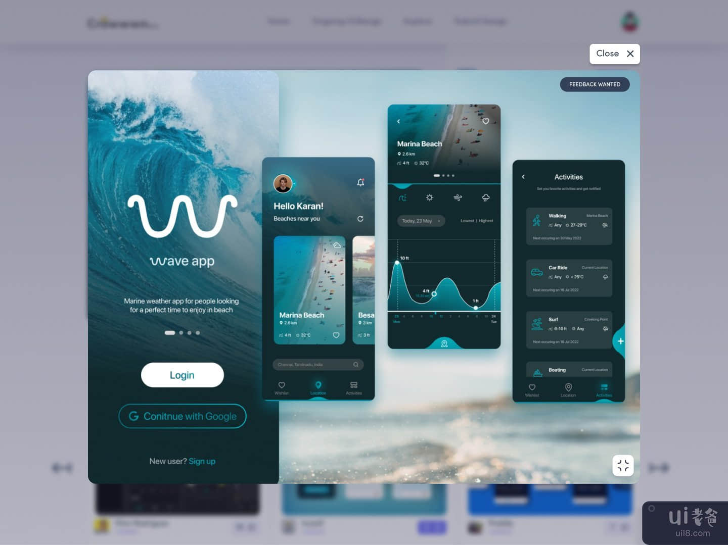
重新设计皇冠(Redesigning Crowwwn)

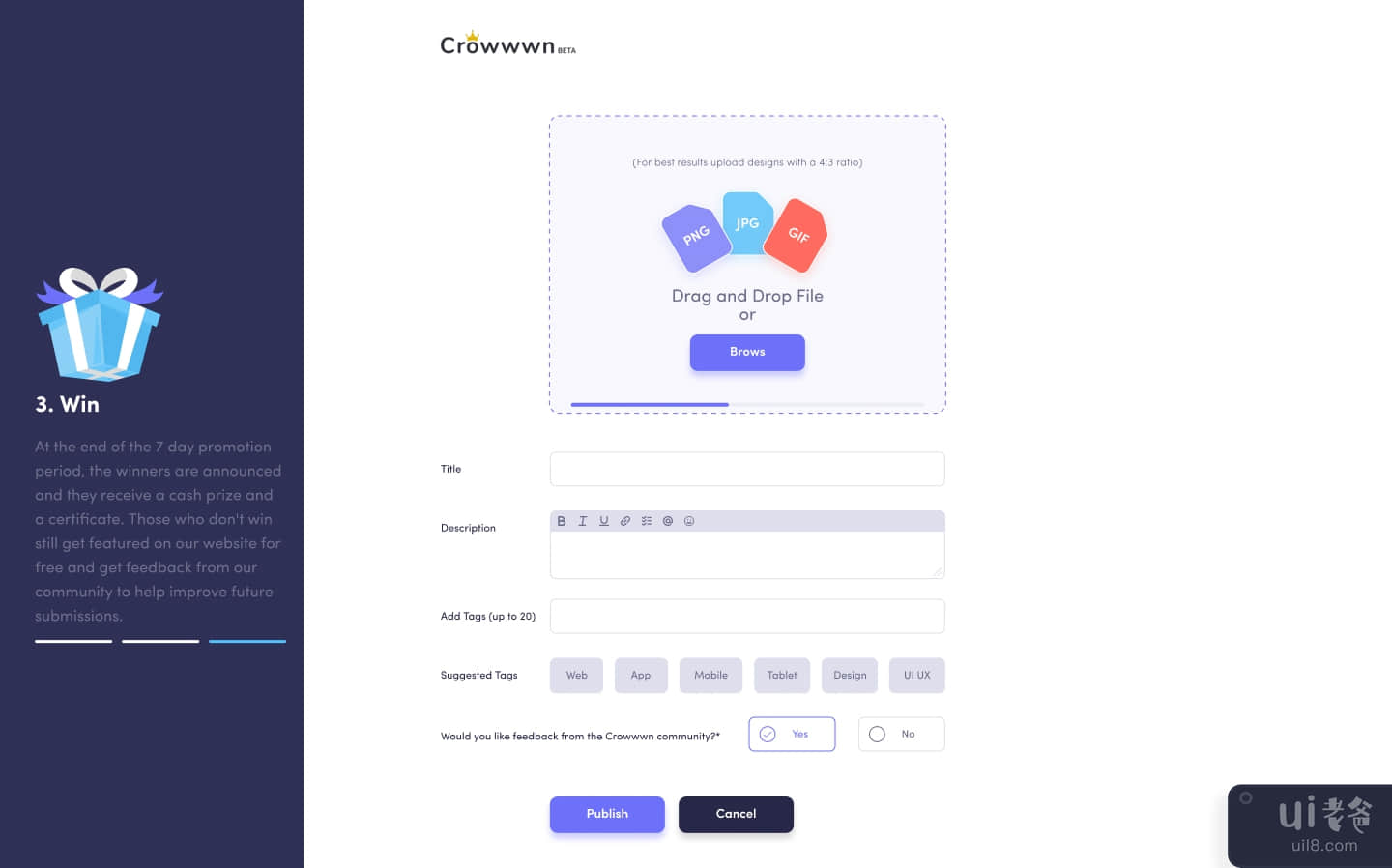
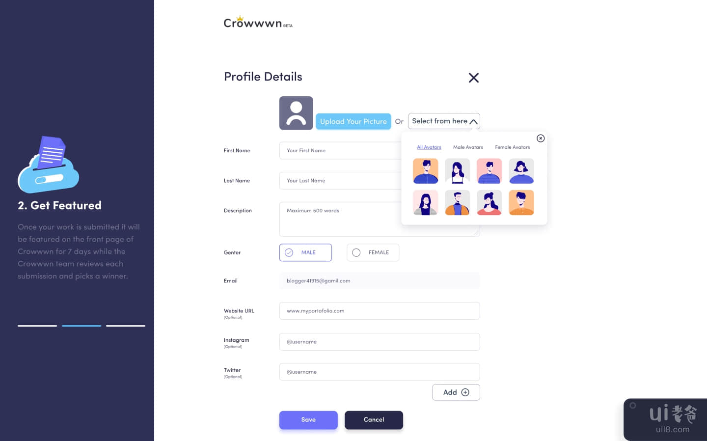
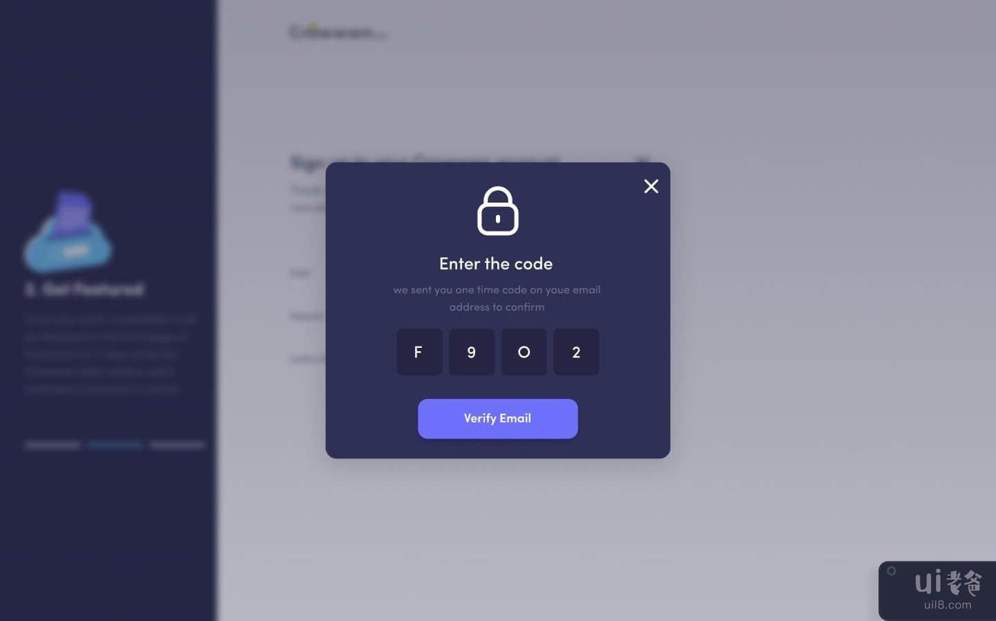
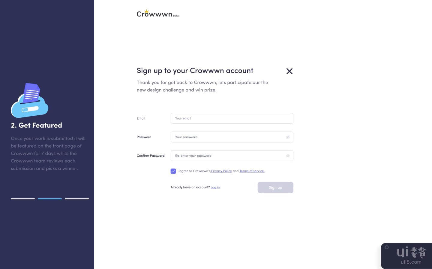

-中文-
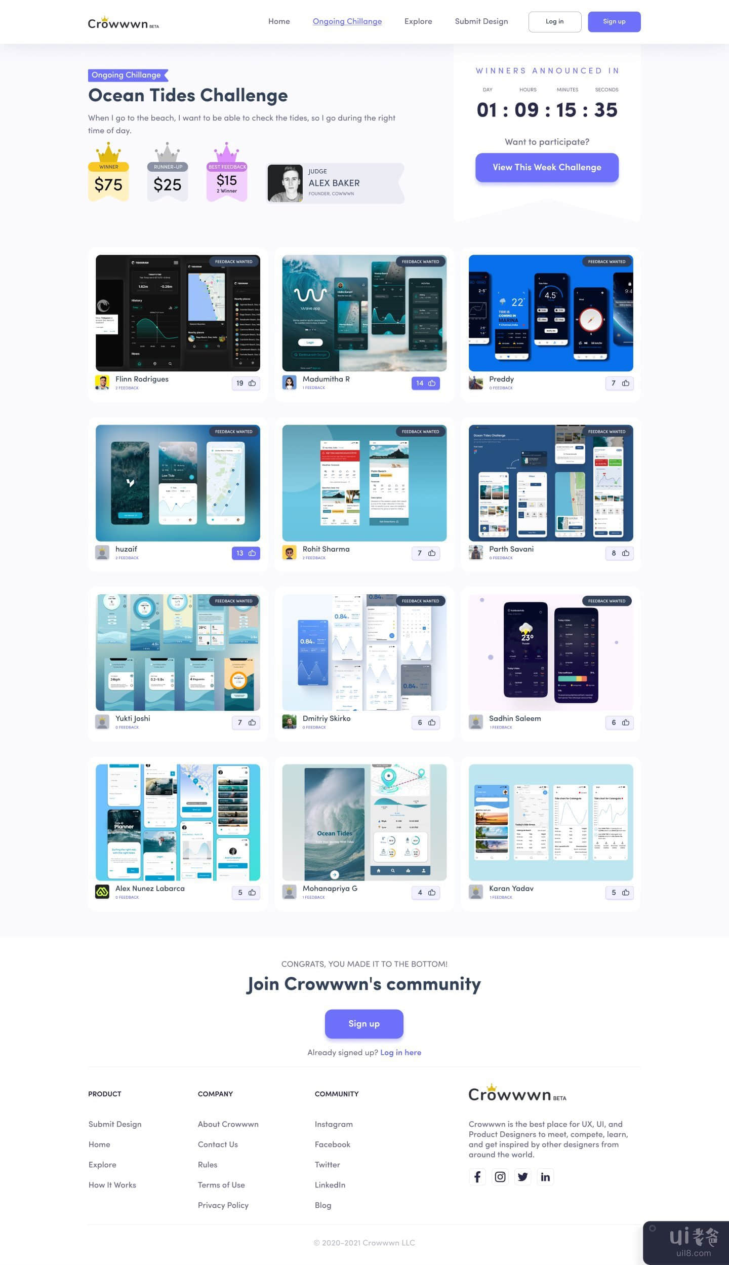
正如你们大多数人所知,crownn 是一个供设计师练习、获得反馈和向来自世界各地的其他设计师学习的社区。以及可以上传作品、获得反馈、探索、建立在线作品集和寻找工作机会的创意人员。
Crowwn 还拥有通过参加每周挑战来赢取奖品的最佳场所。
谁是用户?用户是希望在 UI/UX 设计 领域建立职业生涯的有志者。
为什么我们需要 Crownn?
- 因为展示我们的技能并从同一个社区学习,有时也有助于赚一些钱。
- 它有助于我们获得更新设计系统的趋势并分析性能。
- 这是与同一社区联系的最有效方式。
< li>它减少了设计师浏览每个网站以获取灵感、紧跟潮流并展示他们的设计技能的时间。这就是为什么 crowwwn 和这样的网站可以在那里使用的原因。
为什么要重新设计?当我查看网站时而且我是 crowwn 社区的一员,我发现它的视觉效果并不好,并且可以添加许多缺失的功能来增强用户体验和用户界面。它需要重新设计,或者您可以说是修饰。其次,当我开始查看用户反馈时,我非常确定用户对当前网站的外观不满意,并且可能会有更多事情。
目标< /strong>✔ 好:使其具有视觉吸引力✔ 易于理解:当前使用的 UI 元素和适当的信息架构。✔可扫描: 确保突出显示重要的关键点以吸引眼球.✔ 有帮助: 设计的方式应该告诉我们我们在哪个领域表现出色或做得很好。< /em>
分析我浏览了几个设计网站。收集了一些真实网页设计灵感的图片,如 Dribbble、Behance、Uplabs 等,并列出了模式,并指出了它们的异同。颜色、图标、框、间距、选项卡、过滤器、文本链接和布局等模式。
我收集的内容:
- 关键信息位于页面顶部.
- 矢量的使用。
- 最少使用颜色。
- 粗体文本。
- Because to show our skill and learn from the same community, sometimes it also helps to earn some money.
- It helps us to get updates on what is in trend in the design system and analyzes performance.
- It is the most efficient way to connect with the same community.
- It reduces the time for the designer to go through every individual website to get inspired, stay updated with trends and showcase their design skills. This is why crowwwn and such websites are available out there.
- Key information is at the top of the page.
- Usage of vectors.
- Minimal usage of colors.
- Bold Texts.
结论🚀我开始这个案例研究是为了发现我在使用 Crowwn 平台时遇到的困难。我是这个平台的早期用户之一,从那时起我就注意到了改进的必要性,我的设计师朋友过去也有同样的想法。然而,到目前为止,crowwwn 的团队已经在 crowwwn 的网站上自己做了很多改进。但是我试图通过这个案例研究来应对的变化应该有利于 Crowwn 的网站及其所有用户。我的整个想法是更多地关注用户体验并重新设计 crownn 的平台,以便新用户不会面临与我们相同的困难所有人都必须面对。
感谢 crowwwn's 的创始人 Alex Barker 开发了如此可爱且乐于助人的 UX 设计师社区。也由于这个平台,我开始了我的第一个 UX 案例研究,它帮助我学习和对我自己的技能进行各种增强。
我喜欢这个设计思维过程的每一步,希望你会觉得它值得一读。感谢您在这个案例研究或 Crowwn 的重新设计中付出宝贵的时间和兴趣查看你很快就会在我的下一个 UI/UX 挑战和案例研究!签收, ME UI/UX 设计师😂
如果你不想错过其他照片,别忘了关注我。
请稍加欣赏! &显示一些❤并关注我。
在我的社交资料上关注我UPLABS | DRIBBBLE | INSTAGRAM | TWITTER | BEHANCE |PINTEREST | LINKEDIN | FACEBOOK | MEDIUM |
我有空自由项目 - 👽blogger41915@gmail.com享受吧!
-英文-
As most of you know crowwwn is a community for designers to practice, get feedback, and learn from other designers from all around the world. And creatives who get to upload their work, get feedback, explore, build an online portfolio and find job opportunities.
Crowwwn also has the best place to win prizes by taking part in weekly challenges.
Who are the users?The users are aspirants who want to build a career in the UI/UX design field.
Why We Need Crowwwn?
Why redesign?As I looked at the website and I am a part of the crowwwn community I didn’t find it visually good and lots of missing features that can be added to enhance the user experience and user interface. It needed a redesign or you can say touchup.Second, when I started to look around the user feedback, I was pretty much sure that users are not happy with the current website look and may more things.
Goals✔ Good: To make it visually appealing✔ Understandable: Current use of UI elements and proper information architecture.✔Scannable: To make sure important key points are highlighted to catch the eye.✔ Helpful: Design should be made in such a way that it tells us in which area we are excelling or doing good.
AnalysisI went through several designing websites. Collected images of a few real web design inspirations like Dribbble, Behance, Uplabs, etc. and made a list of patterns, and noted the similarities and differences they have. Patterns such as colors, icons, boxes, spacing, tabs, filters, text links, and layouts.
What I gathered:
CONCLUSION🚀I started this case study to discover the difficulty I was facing with Crowwwn’s platform. I am one of the early users of this platform and since then I was noticing the need for improvement and my fellow designer friends used to think the same.However, crowwwn’s team has done many improvements by themselves till now on crowwwn’s site. But the changes I have tried to counter through this case study should be beneficial for Crowwwn’s website and its all users.My whole idea was to focus on user experiences more and redesign the crowwwn’s platform so that new users will not face the same difficulty as we all have to face.
I am thankful to Alex Barker, founder of crowwwn’s for developing so an adorable and helpful UX designer community.Also due to this platform, I started my very first UX case study which helped me to learn and do various enhancements to my own skills.
I enjoyed every step of this design thinking process and hopefully you will find it worth reading it.Thank you for giving your valuable time and interest in this case study or Crowwwn’s redesignSee you soon in my next UI/UX challenges & case study!Signing off, ME UI/UX Designer😂
Don't forget to follow me if you don't to miss other shots.
Please show a little bit of appreciation! & show some ❤ and follow me.
FOLLOW ME ON MY SOCIAL PROFILEUPLABS | DRIBBBLE | INSTAGRAM | TWITTER | BEHANCE |PINTEREST | LINKEDIN | FACEBOOK | MEDIUM |
I'm available for the freelance project - 👽blogger41915@gmail.comEnjoy!

