金融科技:仪表盘用户界面(fintech: dashboard user interface)
插图")
插图1")
-中文-
-英文-
Hey there!
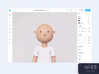
Business and finance are subtle activities requiring much attention to numbers. Obviously, UX should be at the start of the line to transform data processing into a simple task.
Managing invoices and financial distribution must be accurate, so I've done what was needed.
Easier adaptability and clearness means fewer mistakes and better efficiency in executing things. Guess what? I started by started with a layout and setting the right balance between the interface elements.
At the "beautify" stage I went with that iridescent touch in the down right corner, as well as painted over a few blocks with soft but indicative colors for better item differentiation. Also added project icons on the side menu to switch over your projects.
What do you think ? :)
Looks awesome? We think so too. Come hang out with us at our website for case studies or follow us on Instagram so you don't miss any single update.