Ninox用户界面的演变 第一部分(Ninox User Interface Evolution Part 1)
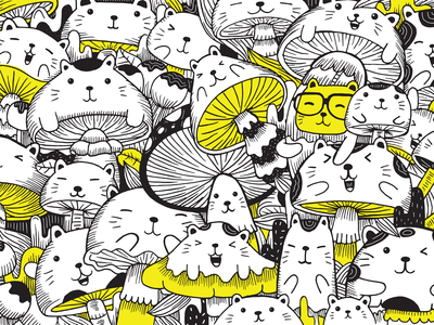
插图")
-中文-
-英文-
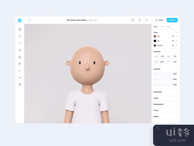
Ninox transformation with a new interface visual layout
Together with our partners from the client team, we built a hypothesis that the outdated visual style couldn't make the users believe in Ninox's high-quality features.
Thus, creating low customer retention. We did not make any tremendous changes to all UI/UX elements. Instead, our corrections were slight and had more of a visual impact on the overall picture that simplified a screen navigation process. Concurrently, producing a feeling of a refreshed and modern product. As a result, the number of users who went from trial to paid product versions increased by 21%, and the retention rate raised from Day-1 (57%) to Day-7 (59%).
声明:本站所有文章,如无特殊说明或标注,均为本站原创发布。任何个人或组织,在未征得本站同意时,禁止复制、盗用、采集、发布本站内容到任何网站、书籍等各类媒体平台。如若本站内容侵犯了原著者的合法权益,可联系我们进行处理。