航运公司移动网站(Shipping Company Mobile Website)

-中文-
-英文-
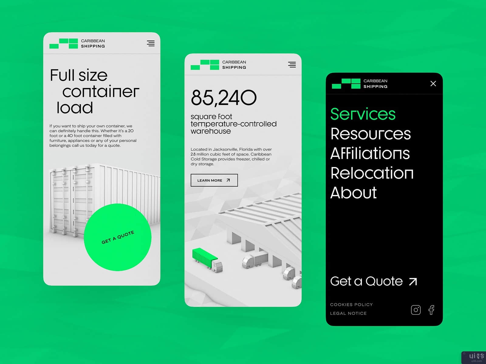
Take another look at the website design for the company providing shipping and distribution services. Limited color palette with bright catchy accents, 3D images, readable but original typography, and clear data visualization help to give the meaningful message about the service and impress the visitors. Here you can see the flow of map interactions. This time you can check how it looks on mobile. Stay tuned to see more!
Also, welcome to read about types of images in web interfaces, check the best practices of video integration in UX design, learn how to reach design consistency, and review the guide into basic types of web pages.
Tubik | Behance | Instagram | Twitter | Facebook
声明:本站所有文章,如无特殊说明或标注,均为本站原创发布。任何个人或组织,在未征得本站同意时,禁止复制、盗用、采集、发布本站内容到任何网站、书籍等各类媒体平台。如若本站内容侵犯了原著者的合法权益,可联系我们进行处理。


