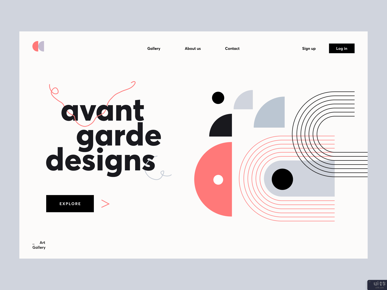
Avant主页设计(Avant home page design)

-中文-
-英文-
Hey all,
Creating a gallery website is already real art. What if it’s a website? How to create a beautiful design that will not overload viewers with information and leave all the most delicious for visitors? NS. On this question, I was fed up giving myself an answer at the moment when I started working on this site. The figures in the background and the beautiful work with the fonts were my trump cards. Pay attention to the work with color — it was not easy enough — since the gallery does not have a logo like that. And corporate colors, too — we created all this together with the client at the stage of Style Research, and it did not turn out to be perfect right away. But in the end, the work exceeded all the client’s expectations. With his permission, I show you the Hero Section — and I look forward to your comments. How do you like the design, and what would you change?
Design — Figma
************
? I am open to new projects! hey@migulko.cz
************
Instagram | Linkedin | AE+Sketch templates


