淘宝网的网页设计系统 (Fabrx Web Design System)
插图")
插图1")
插图2")
插图3")
插图4")
插图5")
-中文-
概述使用 Fabrx 网页设计系统模板使网站独特且快速。不想从头开始?
我们的网页设计系统允许用户自定义模板以满足他们的特定需求和偏好,还提供优化网站性能的设计,例如快速加载时间。
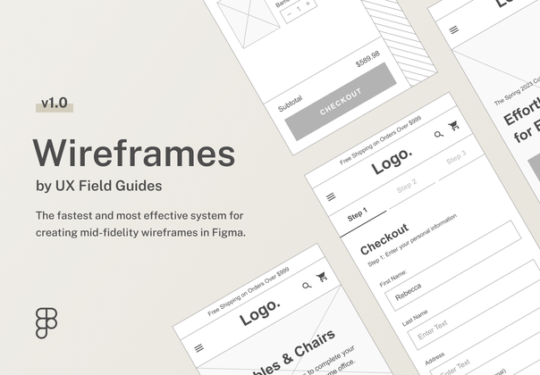
Fabrx 网页设计系统提供了一个多功能且轻松的设计工作流程,其中包含超过 120 个在明暗模式下完美设计的线框。这允许在设计过程中提供更大的灵活性和定制化,因为用户可以从范围广泛的预先设计的线框图中进行选择,并进行调整以满足他们的特定需求和偏好。线框的设计方式使用户可以轻松理解网站的布局和结构,并可以快速轻松地对设计进行更改。此外,在浅色和深色模式下使用线框可以提供更加动态的用户体验,因为用户可以选择最适合他们需求和偏好的方式。
系统中包含的所有线框都是 100% 响应式的,并采用 Bootstrap 网格设计,这意味着它们会自动调整以适应任何屏幕尺寸,无论是台式机、笔记本电脑、平板电脑还是移动设备。这可确保您的网站无论在何种设备上查看都看起来很棒且功能正常。此外,所有线框也可调整大小,因此您可以轻松调整网站的布局和结构以适应您需要的任何屏幕尺寸。此功能可确保您的网站在任何设备上始终保持美观和正常运行,为您的网站访问者提供最佳体验。亮点 240+ 线框 20+ 新模板 600+ 新图标明暗模式草图/Figma/XD 文件终身更新格式 322.5 MB in1 文件
-英文-
OverviewMake the website unique and fast with Fabrx web design system templates. Don't feel like starting from scratch?
Our web design system allows users to customize the templates to fit their specific needs and preferences and also provides designs for optimizing website performance, such as fast loading times.
Fabrx web design system offers a versatile and effortless design workflow with over 120 wireframes that are perfectly designed in both light and dark modes. This allows for greater flexibility and customization in the design process, as users can choose from a wide range of pre-designed wireframes and make adjustments to suit their specific needs and preferences. The wireframes are designed in a way that makes it easy for users to understand the layout and structure of the website and to quickly and easily make changes to the design. Additionally, having wireframes in both light and dark modes allows for a more dynamic user experience, as users can choose the way that best suits their needs and preferences.
All of the wireframes included in the system are 100% responsive and designed with Bootstrap grids meaning they automatically adjust to fit any screen size, whether a desktop, laptop, tablet, or mobile device. This ensures that your website will look great and function properly no matter what device it is viewed on. Additionally, all wireframes are also re-sizable, so you can easily adjust the layout and structure of the website to fit any screen size you need. This feature guarantees that your website will always look great and function correctly on any device, giving your website visitors the best possible experience.Highlights240+ Wireframes20+ New Templates600+ New IconsLight and Dark ModeSketch / Figma / XD FilesLifetime UpdatesFormat322.5 MB in1 File